I’ve been thinking about how to explain an A- or B-Basis value to people without much statistical knowledge. These are the names used in aircraft certification for the lower tolerance bounds on material strength. The definition used for transport category aircraft is given in 14 CFR 25.613 (the same definition is used for other categories of aircraft too). This definition is precise, but not easy to understand.
… (b) Material design values must be chosen to minimize the probability of structural failures due to material variability. … compliance must be shown by selecting material design values which assure material strength with the following probability:
(1) Where applied loads are eventually distributed through a single member within an assembly, the failure of which would result in loss of structural integrity of the component, 99 percent probability with 95 percent confidence.
(2) For redundant structure, in which the failure of individual elements would result in applied loads being safely distributed to other load carrying members, 90 percent probability with 95 percent confidence. …
Another way of stating this definition is the lower 95% confidence bound on the 1-st or 10-th percentile of the population, respectively. But, describing it that way doesn’t help to explain the concept to a person who’s not well versed in statistics.
The Explanation
There’s some random variation in all material properties. Some pieces of any material will be a little bit different than other pieces of the same material. To account for this variation in the material properties when we design aircraft structure, we design it so that there’s at least a 90% chance that redundant structure is stronger than it needs to be (or 99% of non-redundant structure).
When we test a material property, we get a sample. This sample is not a perfect representation of the material property. A good analogy is that a sample is like a low-resolution photo: it gives us an idea of what we’re seeing, but we don’t get all the detail. We can get a better idea of what we’re seeing by taking a higher resolution photo: this is akin to testing more and getting a larger sample size.
We choose a statistical distribution that fits the data, then find the tenth (or first) percentile of that distribution. But since we only have a sample of the material property (a “low-resolution photo”, in the analogy), we’re not sure if the distribution that we chose is correct. To account for that uncertainty, we try out many possible distributions for the material property and determine how likely each is to be true based on the sample (the data). Distributions that look a lot like the data are highly likely; distributions that look different than the data are less likely, but depending on how “low-resolution” our data is, they could be correct. For each of these possible distributions, we find the 10th percentile (for B-Basis; it would be the 1st percentile for A-Basis). Next, we weight each of those individual 10th percentiles based on the likelihood that the corresponding distribution is true, and we find a lower bound where 95% of those weighted 10th percentiles are above that lower bound.
Or in graphical form:
I hope that this explanation helps explain this complicated topic. If you think you have a better explanation, please connect with me on LinkedIn and message me there.
Developing the Graph
Let’s look at how I developed this graph. The graph was developed using the R language. As for most R code, we start by loading the required packages.
library(tidyverse)
library(cmstatr)
library(stats4)
In this example, we’ll use some of the sample data that comes with the
cmstatr package. We’ll be using the
room-temperature warp-tension example data.
dat <- carbon.fabric.2 %>%
  filter(test == "WT" & condition == "RTD")
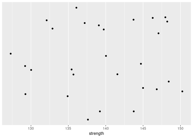
Let’s start by plotting this data. We’re plotting 1-D data, so we only need one axis. But in order to make sure that none of the data points overlap, we’ll add some “jitter” (random vertical position). We’ll also hide the vertical axis since this axis is not meaningful.
dat %>%
  ggplot(aes(x = strength)) +
  geom_jitter(aes(y = 0.01), height = 0.005) +
  scale_y_continuous(name = NULL,
                    breaks = NULL)
We can fit a normal distribution to this data. The sample mean and standard deviation are point-estimates of the mean and standard deviation of the distribution. We’ll use those point-estimates and draw the PDF superimposed over the data, assuming that the distribution is normal. We can also add the 10-th percentile of this distribution to the plot.
dat %>%
  ggplot(aes(x = strength)) +
  geom_jitter(aes(y = 0.01), height = 0.005, color = "magenta") +
  stat_function(fun = function(x) dnorm(x, mean(dat$strength),
                                        sd(dat$strength))) +
  geom_vline(xintercept = qnorm(0.1, mean(dat$strength), sd(dat$strength)),
             color = "blue") +
  scale_y_continuous(name = NULL,
                    breaks = NULL)
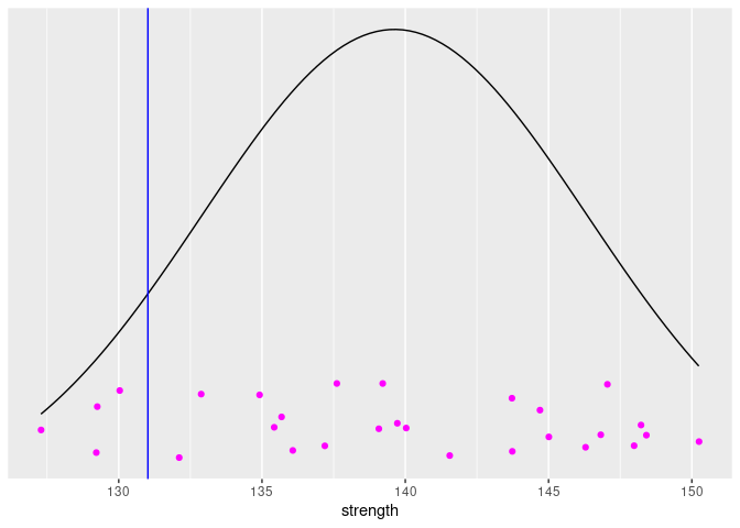
But, the distribution that we’ve drawn is just a point-estimate from the data. There is uncertainty in our estimate. Based on the data, we’ve concluded that this estimate is the most likely, but we shouldn’t be surprised if the true population distribution is a bit different. This point-estimate is actually the Maximum Likelihood Estimate (MLE), based on this particular data. We can calculate the likelihood of various potential estimates of distribution (or rather, the parameters of the distribution) using the following equation:
Here \(X_i\) are the data and there are two parameters for a normal distribution are \(\mu\) and \(\sigma\). The function \(f()\) is the probability density function.
It turns out that computers have trouble multiplying a bunch of small numbers together and coming up with an accurate result. We can avoid this problem by using a log transform:
Implementing this in R:
log_likelihood <- function(x, mu, sigma) {
  sum(dnorm(x, mu, sigma, log = TRUE))
}
To make sure that this function works, we can find the log likelihood of our MLE of the parameters. The actual numerical value of the likelihood doesn’t mean very much to us, but we’ll be interested in the distribution of the likelihoods as we change the parameters.
log_likelihood(dat$strength, mean(dat$strength), sd(dat$strength))
## [1] -92.55627
It’s going to make our life a lot easier if we can work with a single parameter instead of two (\(\mu\) and \(\sigma\)). We’ll treat \(\sigma\) as a nuisance parameter and find the value of \(\sigma\) that produces the greatest likelihood for any given values of \(\mu\). To avoid working with very tiny numbers, we’ll calculate the relative likelihood (the likelihood divided by the maximum likelihood). We can do this in R as follows:
rel_likelihood_mu <- function(x, mu) {
  ll_hat <- log_likelihood(x, mean(x), sd(x))

  opt <- optimize(
    function(sigma) exp(log_likelihood(x, mu, sigma) - ll_hat),
    lower = 0,
    upper = 20 * sd(x),  # pick an upper bound that's big
    maximum = TRUE
  )
  # We'll return a list of the sigma and the relative likelihood:
  list(
    sigma = opt$maximum,
    rel_likelihood = opt$objective
  )
}
We can also do the same thing to calculate the relative likelihood of a a particular 10th percentile (\(x_p\)). We use the transformation \(\mu = x_p - \sigma \Phi(0.1)\).
rel_likelihood_xp <- function(x, xp) {
  ll_hat <- log_likelihood(x, mean(x), sd(x))

  opt <- optimize(
    function(sigma) exp(log_likelihood(x, xp - sigma * qnorm(0.1), sigma) - ll_hat),
    lower = 0,
    upper = 20 * sd(x),  # pick an upper bound that's big
    maximum = TRUE
  )
  # We'll return a list of the sigma and the relative likelihood:
  list(
    sigma = opt$maximum,
    rel_likelihood = opt$objective
  )
}
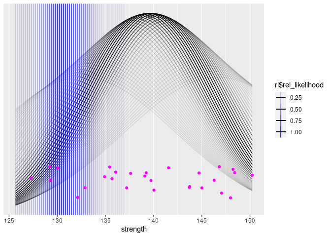
Now, we can draw our same plot again, but this time, we’ll draw a bunch of potential distributions (and 10-th percentiles), coloring them according to their likelihood:
p <- dat %>%
  ggplot(aes(x = strength))

walk(
  seq(from = 0.95 * mean(dat$strength),
      to = 1.05 * mean(dat$strength),
      length.out = 55),
  function(mu) {
    rl <- rel_likelihood_mu(dat$strength, mu)
    p <<- p + stat_function(aes(alpha = rl$rel_likelihood),
                            fun = function(x) dnorm(x, mu, rl$sigma))
  }
)

xp_dist <- imap_dfr(
  seq(from = 0.9 * mean(dat$strength),
      to = 0.98 * mean(dat$strength),
      length.out = 55),
  function(xp, ii) {
    rl <- rel_likelihood_xp(dat$strength, xp)
    data.frame(xp = xp, rl = rl$rel_likelihood)
  })

p +
  geom_vline(aes(xintercept = xp, alpha = rl), data = xp_dist, color = "blue") +
  geom_jitter(aes(y = 0.01), height = 0.005, color = "magenta") +
  scale_y_continuous(name = NULL,
                    breaks = NULL)
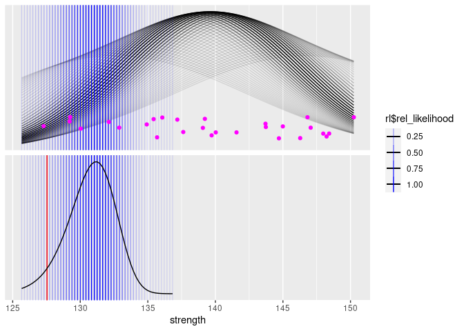
Next, we can add a plot of the distribution of the 10th percentiles.
We’ll also plot the B-Basis, as calculated by the package
cmstatr.
p <- dat %>%
  mutate(f = 1) %>%
  ggplot(aes(x = strength))

walk(
  seq(from = 0.95 * mean(dat$strength),
      to = 1.05 * mean(dat$strength),
      length.out = 55),
  function(mu) {
    rl <- rel_likelihood_mu(dat$strength, mu)
    p <<- p + stat_function(aes(alpha = rl$rel_likelihood),
                            fun = function(x) dnorm(x, mu, rl$sigma))
  }
)

xp_dist <- imap_dfr(
  seq(from = 0.9 * mean(dat$strength),
      to = 0.98 * mean(dat$strength),
      length.out = 55),
  function(xp, ii) {
    rl <- rel_likelihood_xp(dat$strength, xp)
    data.frame(xp = xp, rl = rl$rel_likelihood)
  })

p +
  geom_vline(aes(xintercept = xp, alpha = rl), data = xp_dist, color = "blue") +
  geom_vline(
    aes(xintercept = basis_normal(dat, strength)$basis),
    color = "red",
    data = xp_dist %>% mutate(f = 2),
    inherit.aes = FALSE
  ) +
  geom_line(aes(x = xp, y = rl),
            data = xp_dist %>%
              mutate(f = 2),
            inherit.aes = FALSE,
            color = "black") +
  geom_jitter(aes(y = 0.01), height = 0.005, color = "magenta") +
  facet_grid(f ~ .,
             scales = "free_y") +
  scale_y_continuous(name = NULL,
                    breaks = NULL) +
  theme(strip.text = element_blank())
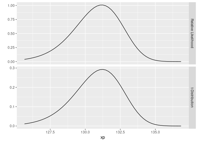
The astute reader might recognize the lower curve as a non-central t-distribution. Since it’s a relative likelihood and not a probability, the vertical scale (which is hidden) won’t match the non-central t-distribution, but it’s the same shape. Just for fun, we can plot the lower curve shown above and a non-central t-distribution:
bind_rows(
  xp_dist %>%
    mutate(f = "Relative Likelihood"),
  xp_dist %>%
    mutate(n = length(dat$strength),
           rl = dt(sqrt(n) * (mean(dat$strength) - xp) / sd(dat$strength), df = n - 1, ncp = qnorm(0.9) * sqrt(n)),
           f = "t-Distribution") %>%
    select(-c(n))
) %>%
  ggplot(aes(x = xp, y = rl)) +
  geom_line() +
  facet_grid(f ~ ., scales = "free_y") +
  ylab("")
Turning our attention back to creating the graph for this blog post, we’ll improve the aesthetics of the graph and also add the annotations:
p <- dat %>%
mutate(f = 1) %>%
ggplot(aes(x = strength))
walk(
seq(from = 0.95 * mean(dat$strength),
to = 1.05 * mean(dat$strength),
length.out = 55),
function(mu) {
rl <- rel_likelihood_mu(dat$strength, mu)
p <<- p + stat_function(aes(alpha = rl$rel_likelihood),
fun = function(x) dnorm(x, mu, rl$sigma))
}
)
xp_dist <- imap_dfr(
seq(from = 0.9 * mean(dat$strength),
to = 0.98 * mean(dat$strength),
length.out = 55),
function(xp, ii) {
rl <- rel_likelihood_xp(dat$strength, xp)
data.frame(xp = xp, rl = rl$rel_likelihood)
})
p +
geom_vline(aes(xintercept = xp, alpha = rl), data = xp_dist, color = "blue") +
geom_vline(
aes(xintercept = basis_normal(dat, strength)$basis),
color = "red",
data = xp_dist %>% mutate(f = 2),
inherit.aes = FALSE
) +
geom_line(aes(x = xp, y = rl),
data = xp_dist %>%
mutate(f = 2),
inherit.aes = FALSE,
color = "black") +
geom_jitter(aes(y = 0.01), height = 0.005, color = "magenta") +
facet_grid(f ~ .,
scales = "free_y") +
theme_bw() +
guides(alpha = guide_none()) +
scale_y_continuous(name = NULL,
breaks = NULL) +
theme(strip.text = element_blank()) +
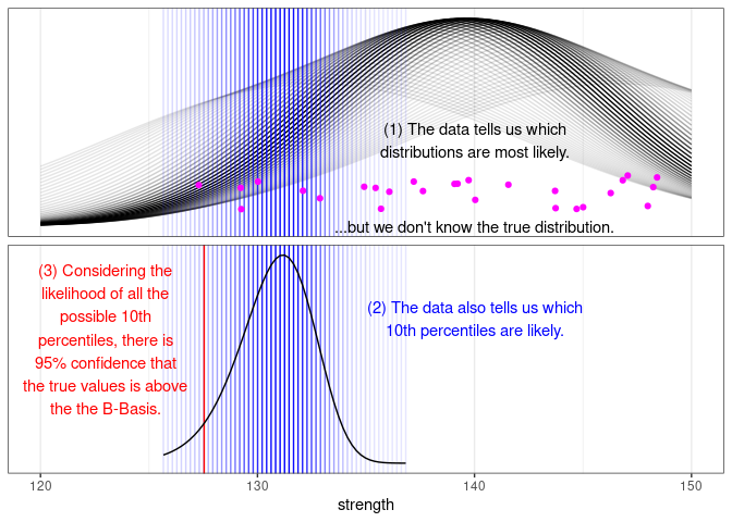
geom_text(
aes(x = x, y = y, f = f, label = label),
data = tribble(
~x, ~y, ~f, ~label,
140, 0.025, 1, "(1) The data tells us which\ndistributions are most likely.",
140, 0.00, 1,
"...but we don't know the true distribution.",
140, 0.7, 2,
"(2) The data also tells us which\n10th percentiles are likely.",
123, 0.6, 2,
"(3) Considering the\nlikelihood of all the\npossible 10th\npercentiles, there is\n95% confidence that\nthe true values is above\nthe the B-Basis."
),
color = c("black", "black", "blue", "red")
) +
xlim(c(120, 150))

And that’s the graph at the beginning of this post.